

About a month ago, the internet was taken by storm, with a debate about whether a dress was blue and black or white and gold. All sorts of people were befuddled, and the productivity of many workplaces came screeching to a halt as employees debated and argued with one another about who was right.
While I did see the phenomenon take hold throughout my daily actions online, I couldn’t have cared less what colors this dress was, for I am colorblind or, more accurately, color deficient. In order to perceive color, eyes have three sets of color receptors, allowing them to perceive more than 100 different hues. The most common color deficiencies derive from one faulty color receptor, causing the eye to rely on just two sets of receptors, limiting the color range in strongly colorblind people to just 20 hues, a drastic decrease. While “true” color blindness, achromatopsia or monochromacy, can result from just one functioning color receptor in the eye, the majority of color blindness does not remove the entire perception of all color.
Like regular eyesight, color blindness or color deficiency, varies on an individual basis. Normally, cases are categorized as being slight, moderate, strong or absolute. These varying degrees create a shared camaraderie for those with color deficiencies, and it is a truly unique experience to compare your list of troublesome colors with a fellow color deficient individual. Because color deficiency is encoded on the X sex chromosome, men are much more likely to be color deficient than women. An estimated 9% of all men suffer from some sort of color deficiency, drastically higher than the 0.5% of women who do.
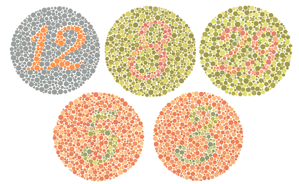
The standard Ishihara color blind test: If you don’t see 12, 8, 29, 5, and 3 you may have some sort of color deficiency.
So how does this relate to that enigmatic blue/black/white/gold dress? Just imagine having that internal or external debate about true color for everything you look at. Living with this uncertainty can affect a person in all areas of life, whether by stopping them from realizing their dream of becoming a pilot or Navy seal, accidentally running a red light because they confused the hazy yellow of a streetlamp with the traditional green of a stoplight, or even the inability to perceive the vast blueness of the Bermuda Ocean or the effect of leaves changing colors in the Fall. (I’ve been told these colors are truly spectacular.)
Color deficiency has created a demographic that many industries, especially design and marketing firms, have overlooked. In my last five workplaces, at least one other person has been afflicted with color deficiency, and that only includes those I talked with enough to divulge this secret. Interestingly, I’ve even encountered a man in his 30s who only learned he was color deficient after I had described my affliction to him.
So what is the solution to connecting with this audience? Is it developing eyewear that can simulate or even restore color perception for individuals with color deficiency? (It’s been done multiple times, most recently through collaboration between EnChroma and Valspar paints.) Is it a medical procedure to fix the faulty color receptors in the eye? (An injection of a virus has effectively cured color blindness in 2 monkeys, and is now hoping to move to human trials.)
No, I believe the way to connect with this audience, is to understand how they interact and identify with colors in the world. Having a color deficiency, I’ve come to love and identify with high-contrast art, such as Mondrian. For me, the composition of light and dark hues together triggers not only a better perception of the art, but a better memory of what I was looking at.
Designing Beyond Color
As a graphic designer, I’ve tried to incorporate this into my work whenever I can. While the average person may be able to tell the difference between lime green letters on a yellow shirt, I try create designs that stand out and are effective in more than one way, whether its concentrating on tint (light or dark) or applying a second identifying method (such as a pattern or shape). My disability has helped me become a more effective designer.
Designing and creating for those with a color deficiency may not be the easiest thing to understand, but should be taken into consideration every time. Endless rounds of “What color is this?” (a cringe-worthy question for many of those afflicted with color deficiency) or theoretical discussions of whether or not the blue that Bob sees is the same as Mary’s blue will resolve nothing. What is really important though, is allowing the perceptions of Colblindors (a truly awesome name for those afflicted with color deficiency) to impact and shape more democratic art and design.
And, so I say this to all those still debating that puzzling dress, “It’s a dark color and a light color, now move on with your day!”
By Kyle Hall, graphic designer at Red Rooster Group
